Seufisio
Seufisio is a management system for physiotherapy clinics and pilates studios: scheduling, client records, reports, and day-to-day operations in one place. When the redesign started in 2018, the product was still a side project at Artemidas, with only 28 active users. Today, with more than 4,000 users, it leads its category and is the company's core product. Over three months, I led research, ideation, information architecture, wireframes, rebranding, and high-fidelity prototyping, with internal validation and usability testing.
Redesign of a live system
Seufisio is a management system for physiotherapy clinics and pilates studios. In 2018, I led the interface redesign of a product that already existed, but still operated at a small scale: only 28 active users, and Seufisio was a side project at Artemidas, far from the core-product role it holds today, with more than 4,000 users and category leadership. The work started by understanding the features already built, with guided access from the sales team and Google Analytics data (daily visits, users, and navigation flows). From there, navigating the system and talking with support were constant, so I could map the product's size and impact.
Challenges
- Legacy system with active users
- Team with no prior experience in ideation workshops
- Visual identity misaligned with how users saw themselves
Responsibilities
- User research and persona definition
- Ideation facilitation and team alignment
- Information architecture (sitemap)
- Wireframes and visual design direction
- Prototyping and usability testing
Goals
Design and develop a new interface in 3 months.
Reach an 80% approval rate among users.
Apply the design guidelines developed for the project.
My role
I led the understanding of the existing system (sales, analytics, support), defined personas and key artifacts, ran 9 in-person interviews with 60 questions and 90 insight cards, facilitated the "Pancada de Pitacos" brainstorm with the teams, built the sitemap with a front-end developer, produced wireframes and directed the visual rebrand, prototyped high-fidelity screens, and ran usability tests with recruitment made easier by earlier interviews.
How could the visual identity reinforce the active professional?
Problem
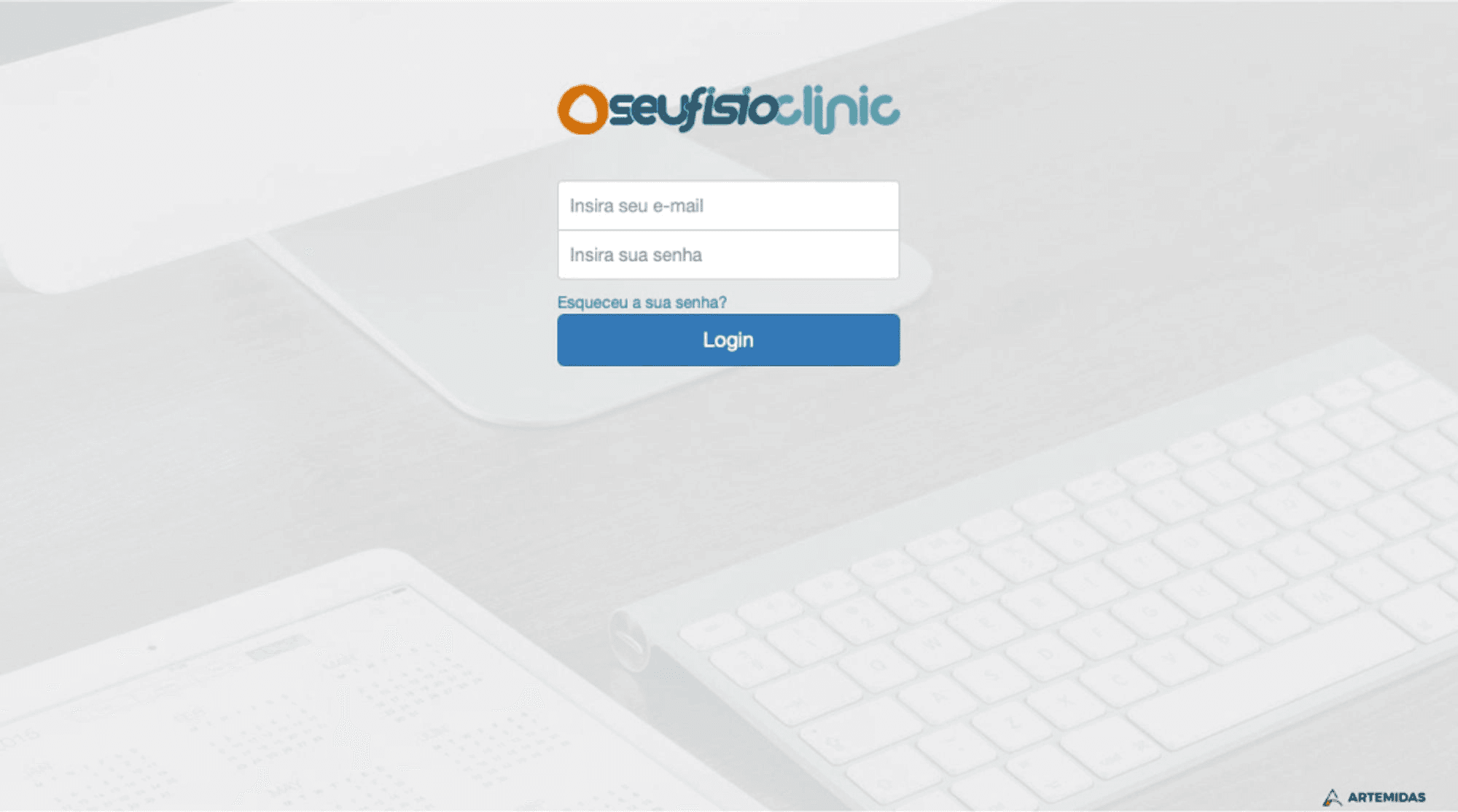
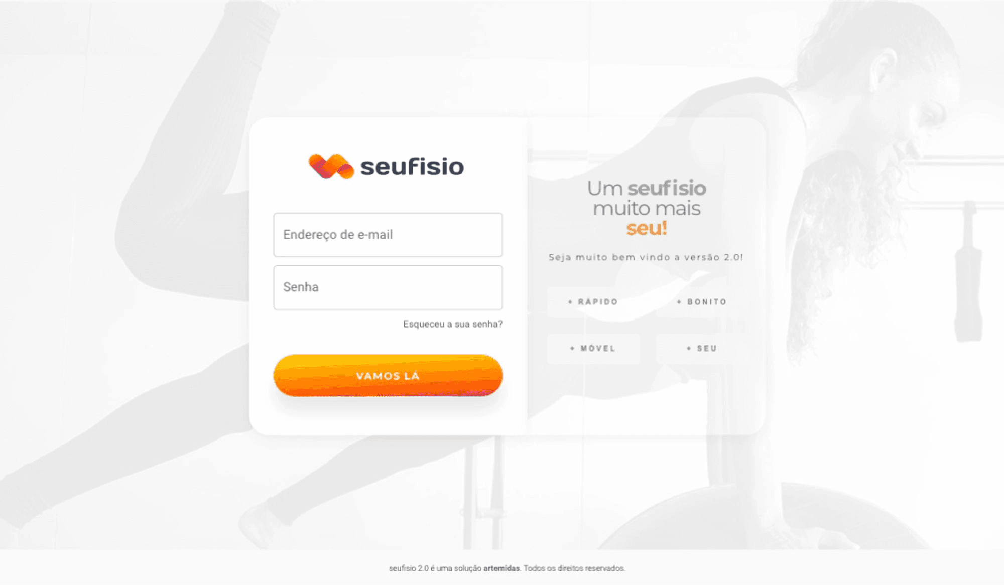
In interviews, we heard that physiotherapists preferred to be seen as active professionals, not as doctors behind a desk. The visual identity reinforced the opposite and affected the day-to-day experience.
How we solved it
I led a visual identity rebrand, which had been too closely tied to a clinical look, starting with the login screen as a proof of concept.
The new identity was tested first on the login screen, preparing the ground for rebranding the rest of the system.
Before
After
How could the client list become useful for new users?
Problem
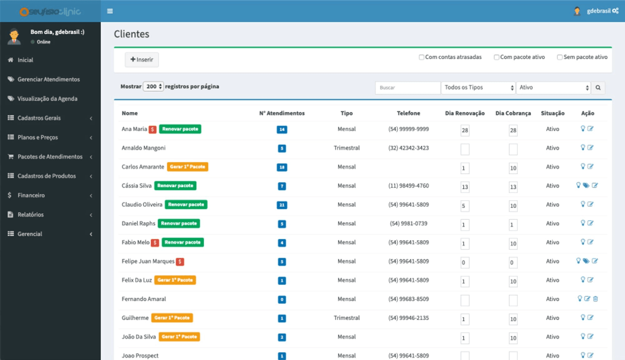
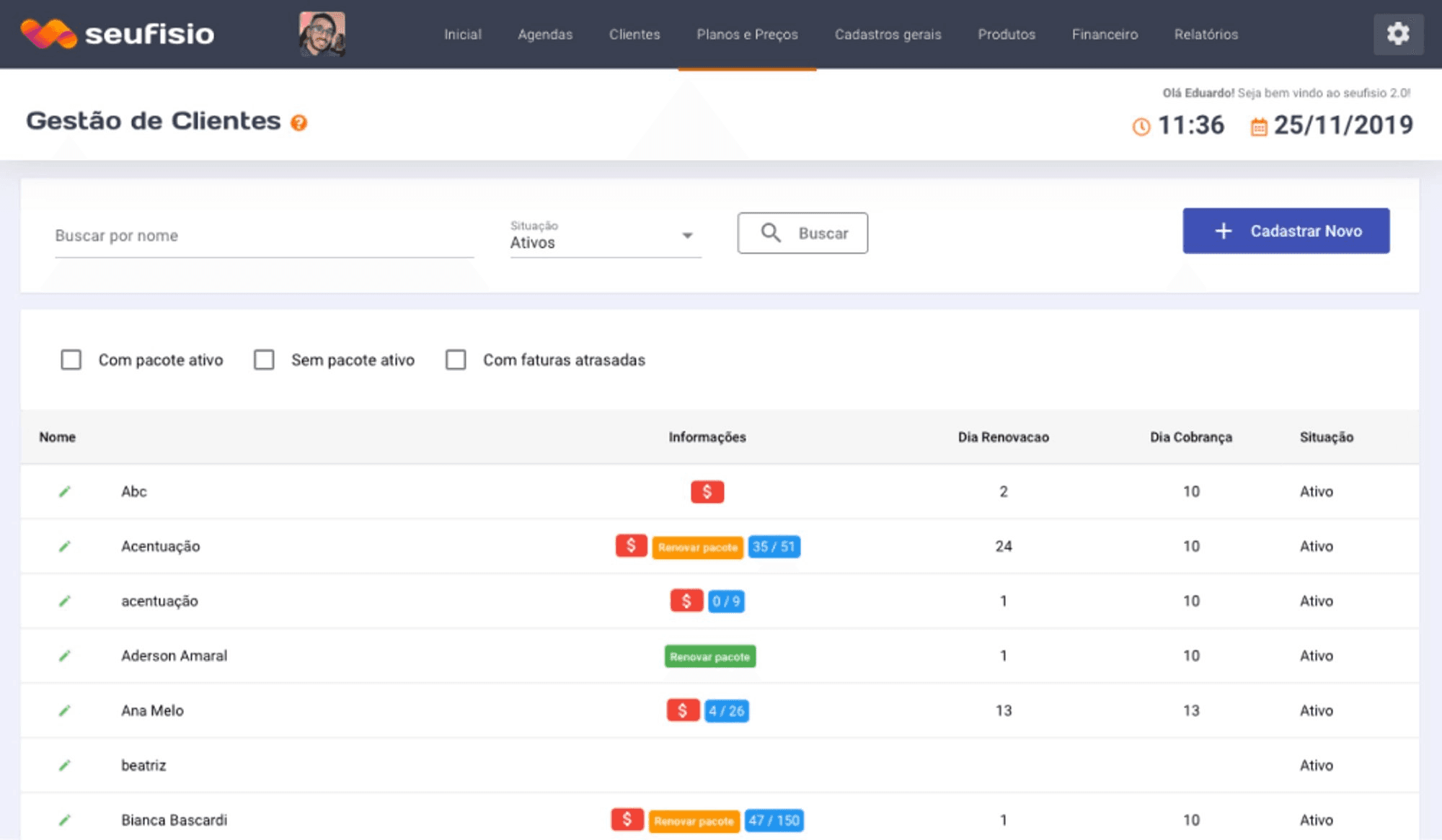
Information was incomplete for new users, action buttons were in the wrong places, and search was not fast enough.
How we solved it
I modularized fields by their related actions, made button labels clearer, and added search with Enter.
The new list became clearer for new users, with faster search via the Enter key.
Before
After
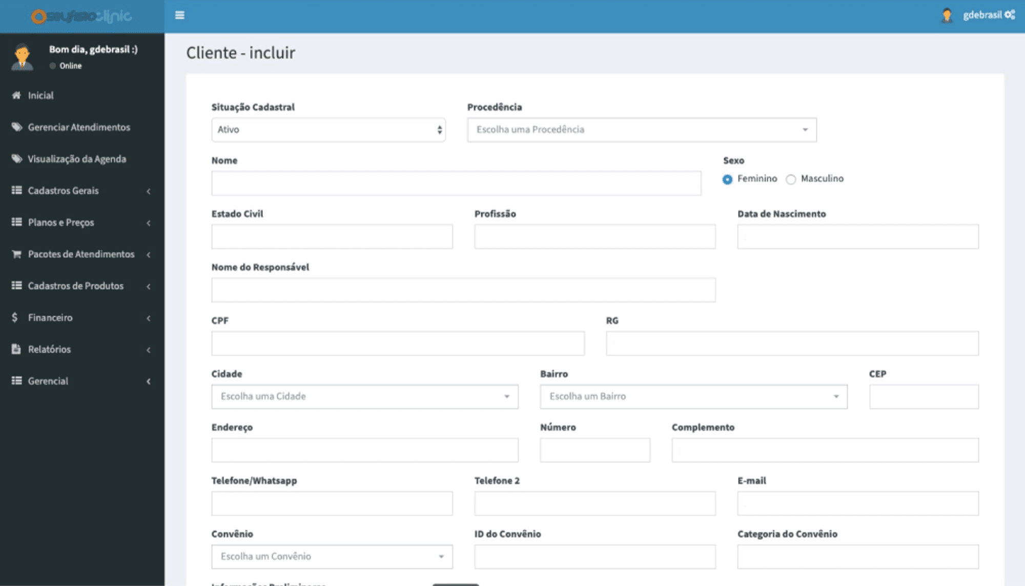
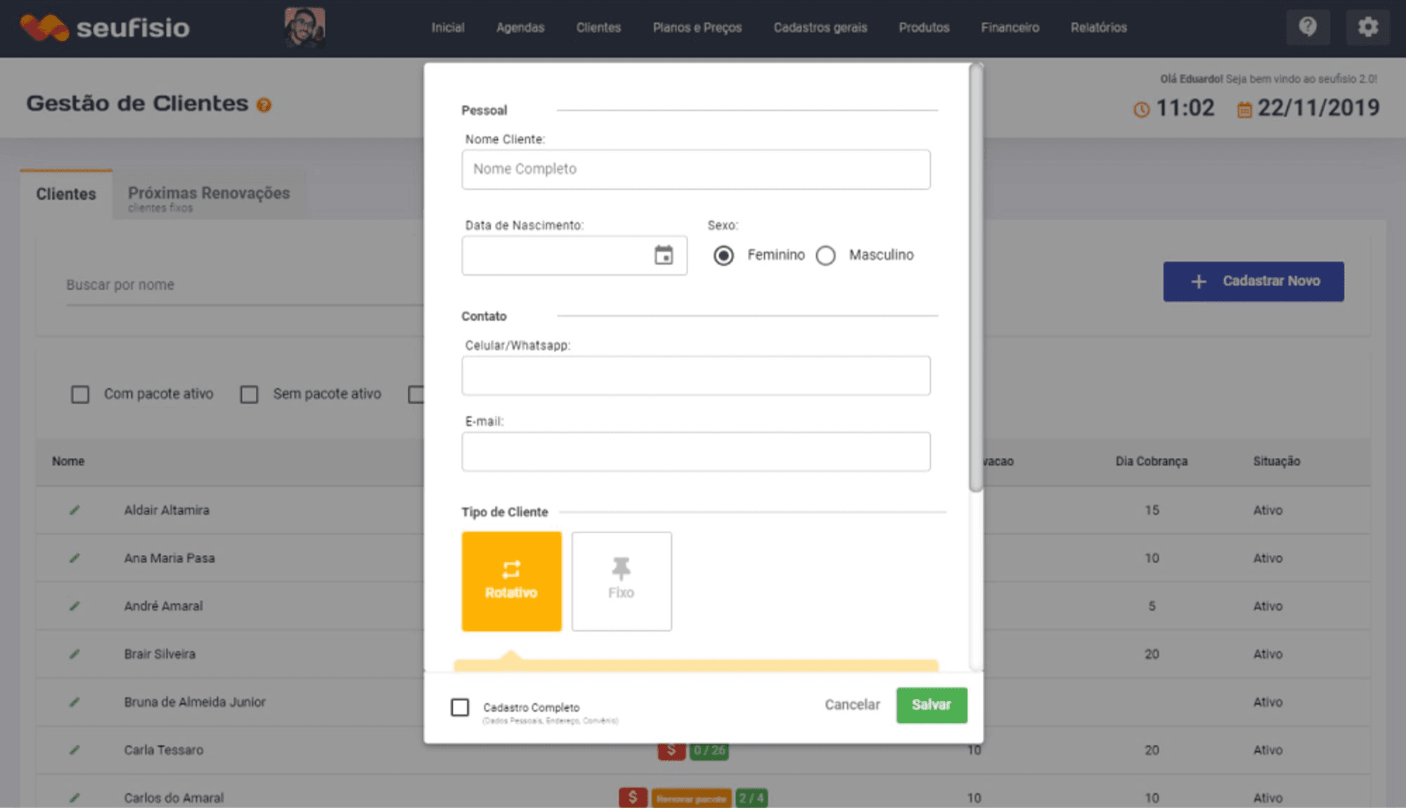
How could we reduce the perceived effort of client registration?
Problem
The screen offered no way back, fields filled the full horizontal space, and information was not properly modularized.
How we solved it
I added a way back, reduced the visual weight of fields, and modularized information properly, with quick save once required fields were filled.
Registration started to feel less lengthy, with a quick-save option after required fields.
Before
After
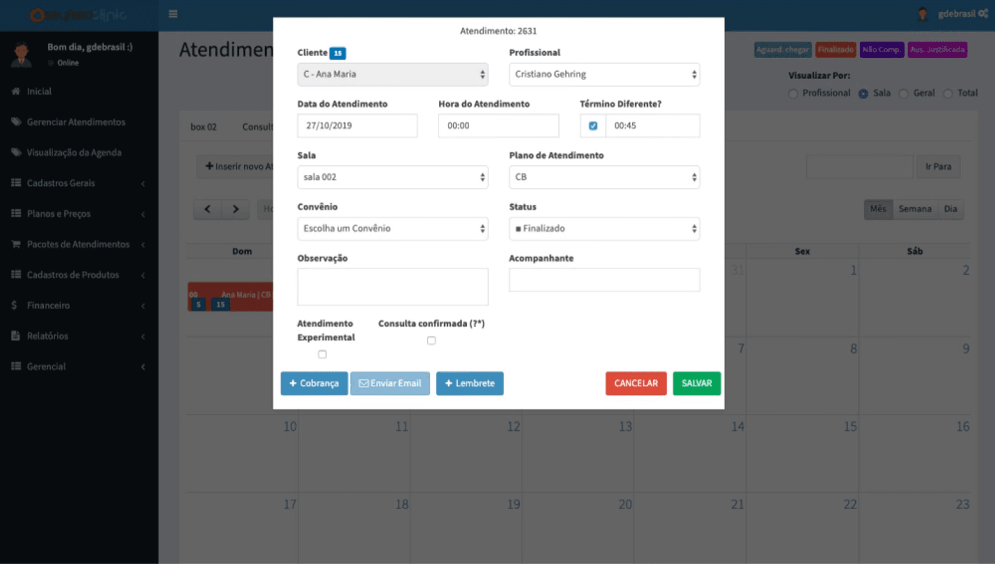
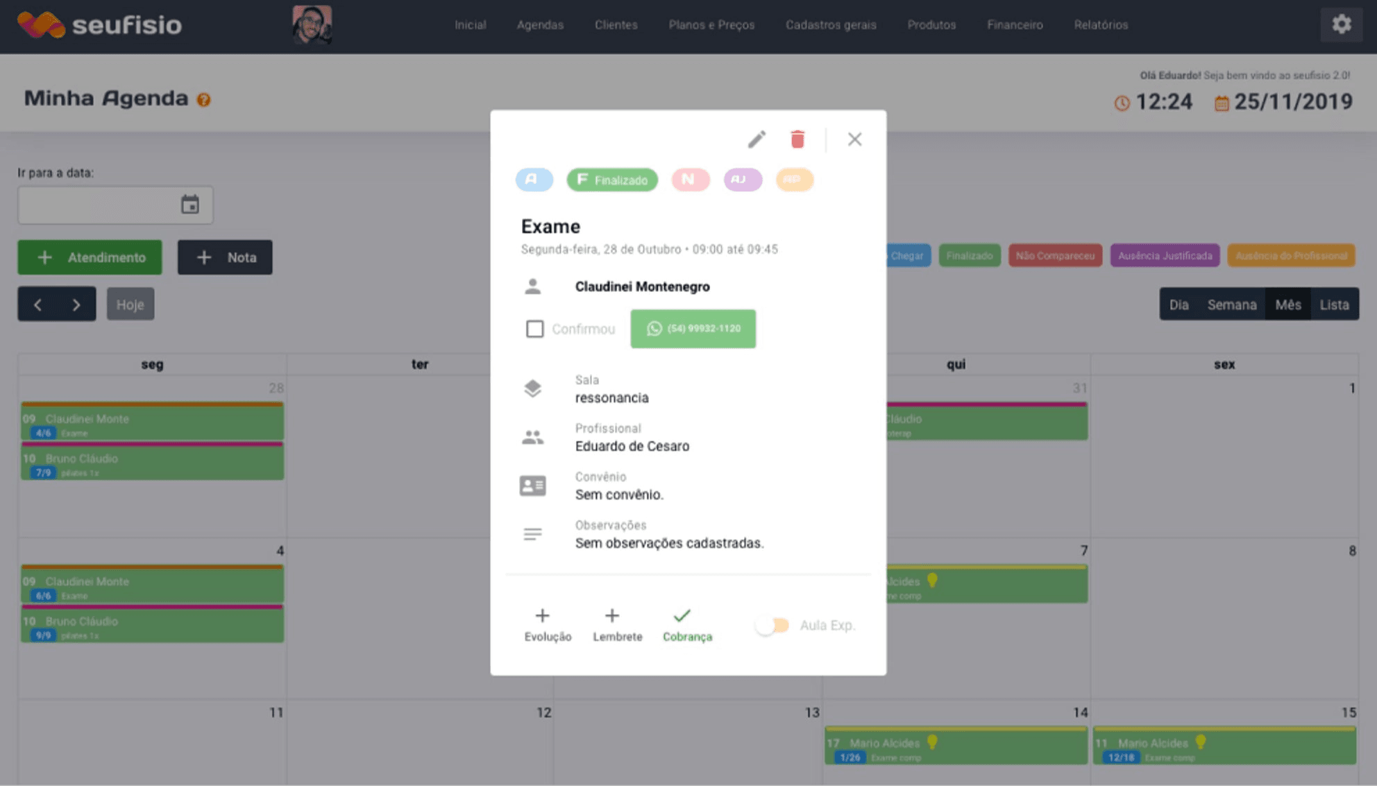
How could we simplify the schedule view?
Problem
There was visual clutter: most of the time users opened the screen to view, not to edit. Fields split a large horizontal space and information was not modularized.
How we solved it
I reduced the visual weight of fields and implemented automatic field-by-field saving, without a confirmation button.
The schedule became easier to read for consultation, with automatic field-by-field saving.
Before
After
How could we involve technical teams in understanding the structure?
Problem
The team needed to align expectations on scope and structure of the legacy system before investing in visual production.
How we solved it
Build a sitemap of the current system with a newly hired front-end developer, using octopus.do.
Discussions about structure and features started to happen with a shared reference, speeding up technical decisions.
How could we recruit participants for usability tests?
Problem
Recruitment is often a bottleneck after prototyping.
How we solved it
Invite interviewees during the initial interviews to join later stages of the process.
Recruitment became simpler in the testing phase, with participants already familiar with the product.
Quantitative Impact
- 89%
- User satisfaction rate
Qualitative Impact
Prototypes delivered for handoff and built by the team
A working methodology documented for future projects
Top grade on the course final project
Other assets
In retrospect
The sequence of design guidelines (understanding, personas, interviews, ideation, sitemap, wireframes, visual design, prototyping, internal validation, and testing) made it possible to evolve the redesign on evidence and continuous alignment with the team.
The learnings earned a top grade on the final course project and a working methodology to apply and refine in future projects.
Other cases