Complex design ≠ confusing design
Why complex products do not need to hide their nature to offer a clear experience.
10 min read
Designing for people who operate dense systems changes what we ask of an interface. In tools for developers, operators, and administrators, clarity rarely comes from hiding what exists. It comes from organizing relationships, states, and consequences of work that is already complex.
Working as a Product Designer in these contexts, I learned to distrust cosmetic simplification. Removing controls to look minimalist usually just shifts effort onto memory, navigation, or trial and error. Like the pilot facing the cockpit, the person learns the language of the system: its groupings, behaviors, signals, and consequences.
An airplane is not well operated because it has few controls. It is well operated because those controls form a consistent system the pilot can learn, interpret, and master. The pilot is the user of that interface. They do not need the cockpit to hide everything that makes flight complex. They need to understand what is happening, recognize priorities, and know how their actions affect the system.
The same distinction matters in digital products used daily by developers, operations teams, and professionals who make decisions with real consequences. These people do not necessarily need an interface that looks simple at first glance. They need a tool that becomes clear, predictable, and efficient as they build mastery over it.
In Living with Complexity, Don Norman argues that the richness of our activities requires tools capable of representing that richness. The problem appears when necessary relationships are presented arbitrarily, without structure, feedback, or a model that helps the person predict what will happen.
The role of design is not to make every product look simple. It is to keep its complexity from turning into confusion.
An interface can require learning without being poorly designed. The criterion is not the absence of initial effort, but the existence of a logic that lets people build mastery, recognize states, and act with confidence.
Complex or confusing?
The number of features stays the same in both states. What changes is the organization.
Production environment
3 items, 3 conditions, recently updated
| Resource | Condition | Location | Activity | Actions |
|---|---|---|---|---|
| API Gateway | Normal | São Paulo | 2 min ago | |
| Object Storage | Limit | São Paulo | 4 min ago | |
| Edge Worker | Active | Virginia | 6 min ago |
The amount of information did not change. What changed was the ability to interpret it.
Complex is not a synonym for confusing
Complexity describes a domain with many variables, dependencies, states, permissions, configurations, real-time data, and possible paths. On an infrastructure platform, a decision can affect security, cost, availability, and performance. Those relationships were not created by the interface. The interface needs to represent them.
Confusion is something else. It appears when hierarchy is weak, names change without reason, similar actions show up in different places, and the system does not confirm what it did. It also appears when important states depend on memory, when controls stay hidden without criteria, and when each screen seems to follow its own logic.
Norman separates the complexity of the world from the feeling of facing something complicated. One can be necessary. The other signals that the product did not offer enough structure to interpret the parts. That distinction changes the design question: instead of counting elements, we need to understand whether the relationships among them are readable.
Reducing elements can lower visual noise, but it can also remove context, comparability, and awareness of system state. If someone needs to open five pages to rebuild a view that could fit on one well-hierarchized screen, complexity did not disappear. It was converted into navigation, memory, and time.
When minimalism starts to hide the work
"Clean" and "minimalist" became shortcuts to communicate quality. A composition with lots of empty space can convey calm and care, but that describes an appearance, not the difficulty of the task. Perceived simplicity, simplicity of use, low visual density, and low complexity are different properties.
An empty screen can force the user to navigate across several pages, open menus, switch between tools, memorize values, and repeat operations. The work still exists; it just stopped being visible. The Law of Conservation of Complexity, associated with Larry Tesler, helps see that shift: part of the complexity is inherent and will be handled by the user, the interface, the product, or the platform.
Where complexity is handled
A conceptual reading of Larry Tesler's Law of Conservation of Complexity.
User
Learns the domain, makes decisions and handles consequences.
Interface
Organizes relationships, makes states visible and offers paths to action.
Product and technology
Automate rules, validate operations and absorb work behind the scenes.
Complexity can be handled in different parts of the system, but it is not erased by a visual decision.
The aesthetic and minimalist design heuristic from the Nielsen Norman Group does not recommend erasing necessary information. It recommends reducing noise and protecting the visibility of what supports the task. A minimalist product in that sense can be dense, as long as each element has a function, a priority, and a recognizable meaning.
In the essay on Bauhaus and design in the 21st century, Norman distinguishes creating visually simple objects from making complex technologies understandable. Form matters, beauty matters, and space matters. None of them replaces a conceptual model, visible states, or efficient paths. There is no opposition between beauty and performance. There is a difference between composing a screen and organizing work.
For expert users, learning is also part of the experience
Working as a Product Designer on platforms for developers, I learned that hiding details is not always a way to help. Developers need to understand system state, compare configurations, identify dependencies, investigate causes, repeat operations, and control consequences. They are not looking for complexity out of vanity. They are looking for capability, visibility, and control.
A good tool can feel like a cockpit once the user learns its language. That does not authorize disorganization. On the contrary, the more specialized the work, the greater the responsibility to create stable groupings, precise names, reliable feedback, and relationships that hold from one area to another.
Beginners need guidance, examples, and explicit paths. Frequent users need to preserve context and avoid repetitive steps. Experts need shortcuts, commands, batch actions, saved preferences, and additional levels of detail. Treating everyone as permanent beginners can produce an interface that is easy to meet and frustrating to use every day.
The flexibility and efficiency of use heuristic proposes different paths for different levels of skill. Accelerators do not need to compete with the main flow. They can stay discreet until repetition makes their value obvious. What matters is that the tool lets people build mastery, instead of imposing the same speed on everyone.
Progressive disclosure also helps, as long as it organizes learning and does not permanently hide what frequent users need. A rare option can sit on a second level. A critical state or a recurring action should not require a treasure hunt. Task frequency and consequence should guide what stays visible.
Design systems work as the grammar of complexity
A design system does not simplify a product only by reducing visual variations. Its most important effect is creating a language that can be recognized and learned. Naming, hierarchy, action placement, states, error messages, and destructive conventions stop being isolated decisions.
When filters, searches, tables, confirmations, and feedback follow recurring rules, users spend less energy interpreting the interface and can focus attention on the domain. The complexity of the work remains, but the product does not demand a new literacy on every screen.
A design system does not remove the vocabulary of a complex product. It organizes that vocabulary into a consistent grammar.
Components are only one part. The system needs to explain when to use a pattern, how it behaves, which states it covers, how content should be written, which exceptions are acceptable, and how accessibility is preserved. Without those rules, a library can produce visually similar screens and incompatible behaviors.
Carbon's table documentation shows that level of decision: global actions sit on the table toolbar, row actions use a recurring location, and selection introduces a bulk-action mode. The value is not in copying a specific table, but in making it predictable how complex capabilities coexist.
The design system as a language
Patterns that together become shared language: interpret less and learn once.
A set of design-system practices that reinforce clarity and learning.
- Consistent naming: Stable names and verbs reduce the need to reinterpret every screen.
- Predictable visual hierarchy: The eye finds what matters without rediscovering order in every flow.
- Recurring action placement: Equivalent actions live in the same place and cut visual search.
- Standardized states: Default, hover, focus, disabled and loading follow the same contract.
- Reusable behaviors: Similar interactions respond in similar ways across the product.
- Clear feedback: The system confirms, warns and corrects with readable, predictable signals.
- Conventions for destructive actions: Deletion and risk follow the same confirmation and hierarchy pattern.
- Usage documentation: When to use each pattern stays explicit for design and engineering.
- Accessibility: Keyboard, focus, contrast and semantics are part of the system, not exceptions.
- Design and implementation consistency: The visual contract and the code tell the same story.
The design system did not remove the complexity of the flow. It reduced the number of rules the user has to relearn.
That infrastructure also brings decision and implementation closer. In the article on Design Engineering, I explore how components, prototypes, and code can carry intent closer to the real product. In complex systems, that proximity reduces divergent interpretations between the documented pattern and the shipped behavior.
From a shortcut area to a control center
The previous Azion Console home worked mainly as a shortcut area. It offered access to products, but said little about what was happening in the environment. For an infrastructure platform, reaching destinations is only part of the work. You also need to form a view of the system.
The new direction brought the home closer to a control center. The goal was to help users understand the environment, recognize important information, and start actions with more context. Prioritization, states, and actions did not need to compete for the screen. They needed to establish clear relationships.
Shortcuts were not wrong. They were insufficient to communicate the real function of the product. When the home presents context before action, it reduces the need to navigate only to discover what deserves attention. Density increases in some places, but so does the ability to interpret the environment.
Azion Console, from shortcuts to control
Compare the previous home with the redesigned direction by dragging the divider or using the arrow keys.
Before

After
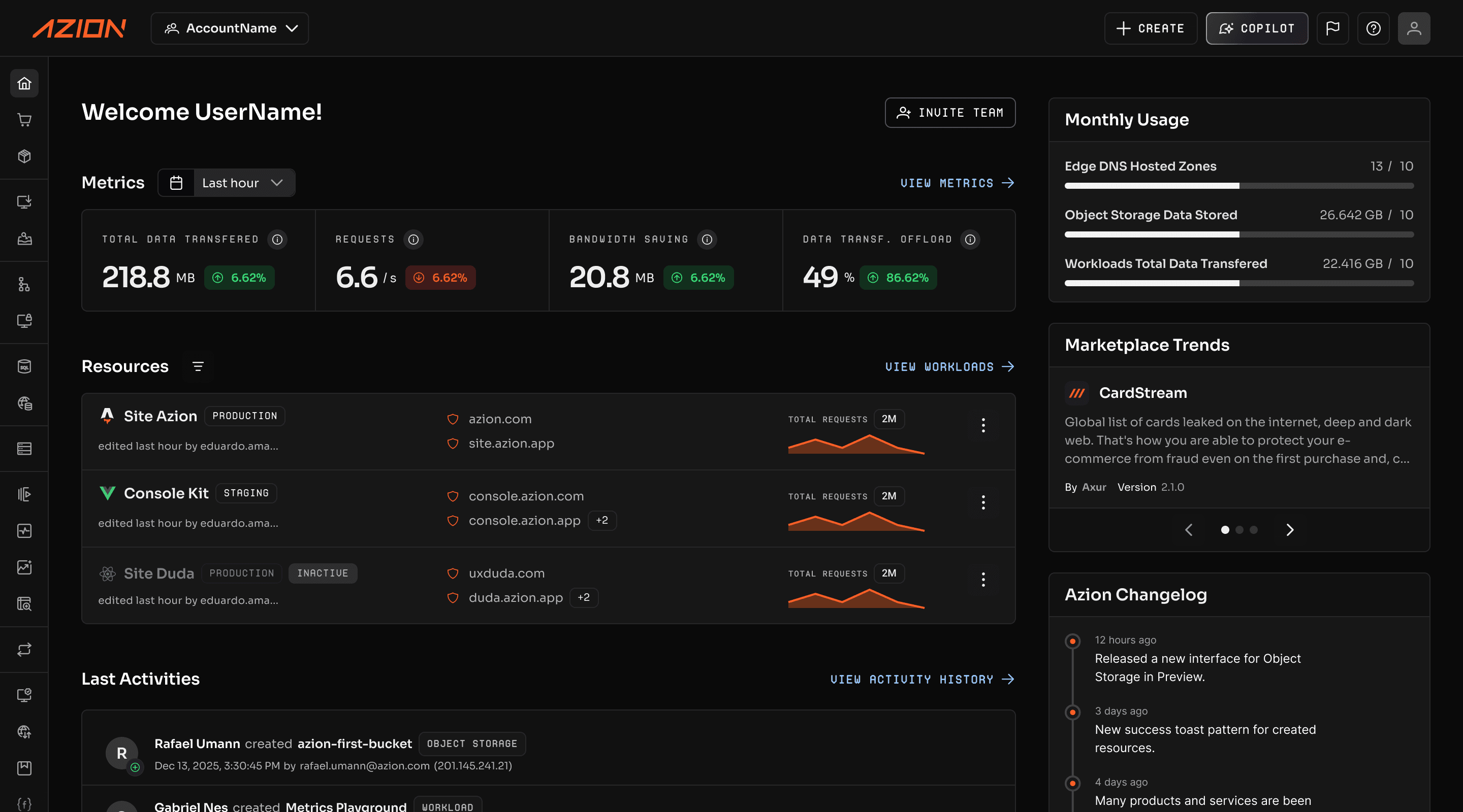
The comparison uses a conceptual reconstruction for the previous version and a real asset of the new home.
This slice does not replace the Azion Console case. It serves as evidence of a larger decision: organizing complex systems requires domain understanding, collaboration with engineering, priority choices, and iteration. There is no perfect or purely visual transformation.
What makes a complex interface understandable
A few principles help evaluate clarity without using the number of elements as a shortcut:
- Complexity should come from the task. Each rule, state, or control needs to represent a domain need. Variations created by internal inconsistency are an interface cost, not capability.
- The system needs to offer a conceptual model. Names, relationships, and navigation should help users build a coherent explanation of how the parts work together.
- Information should match how people work. Grouping by technical structure only works when that structure also guides the task. The product should reflect how decisions are made, compared, and reviewed.
- States and consequences need to stay visible. Before acting, the person needs to recognize the current state. After acting, they need to know what changed, what is still in progress, and how to undo or correct.
- Patterns should survive across areas. Consistency does not mean making every screen the same. It means preserving expectations about names, placement, behavior, and feedback when the intent is the same.
- Frequent users need efficiency. Shortcuts, batch actions, personalization, and non-linear paths let acquired mastery turn into speed without removing the explicit path for beginners.
- Help and recovery should appear in context. Errors need to explain cause and next step. Documentation should sit close to the decision. Progressive disclosure should organize detail, not permanently hide what is recurring.
These principles do not automatically produce a clear interface. They work as questions for design and critique. The answer depends on observing real tasks, testing understanding, and deciding where each part of the complexity will be handled.
Clarity is not the absence of complexity
Living with Complexity returns to a shared responsibility. Designers need to structure, signal, and make system relationships predictable. Users also develop repertoire and skill. Specialist products can require learning, but they need to reward it with more mastery, not with new arbitrariness.
Some problems are complex because the world they represent is complex. Removing controls can simply shift effort to memory, navigation, documentation, or support. Hiding information does not simplify a decision when that information is still necessary.
The cockpit remains a good metaphor because it does not promise a smaller world. It offers instruments to understand conditions, anticipate consequences, and act. Good products do the same: they do not hide all complexity, but make it possible to understand it, master it, and work within it.
References
- Living with Complexity — Don Norman, The MIT Press, 2010
- Then and Now: The Bauhaus and 21st Century Design — Don Norman, JND.org
- Aesthetic and Minimalist Design — Nielsen Norman Group
- 10 Usability Heuristics Applied to Complex Applications — Nielsen Norman Group
- Flexibility and Efficiency of Use — Nielsen Norman Group
- Progressive Disclosure — Nielsen Norman Group
- Design Systems 101 — Nielsen Norman Group
- A Personal History of Modeless Text Editing and Cut/Copy-Paste — Larry Tesler, Interactions, 2012
- Data Table Usage — Carbon Design System